Simplifying How Patient Data is Accessed in OneView

Simplifying How Patient Data is Accessed in OneView

Simplifying How Patient Data is Accessed in OneView

Overview

OneView is an electronic health record that equips DaVita-credentialed healthcare professionals with tools to manage kidney disease patients. There is a growing need to access patient data outside of the dialysis treatment centers, so increasing mobile adoption and retention have been key initiatives. This project aims to optimize Nephrologists' medical charting workflows by simplifying how patient data is accessed.

My Role

Designer
Researcher

Collaborators

1 UX Researcher
1 Product Manager
3 Engineers

Year

2024

Problem

Problem

Problem

“This is a disaster, you cannot check all labs at once. You need to open one tab, view the result, then close, then open a new section, and then review and then close, […] just for one patient.”

— Doctor D., OneView user

On a typical weekday, Nephrologists assess 30 patients across 3 treatment centers. They only have about 4 minutes per person. The existing lab display required them to navigate between up to 8 different screens, which slowed down their workflows during time-sensitive encounters. Such workflow inefficiencies frustrate users and diminish time that is better spent tending to the patient.

User

Dr. Earnest — Nephrologist

Goal: To provide care that improves patients' quality of life

Pain-points: Slow and complicated technology & data that that lacks clear, actionable insights

Scenario

Dr. Earnest briefly meets with Jane during her dialysis treatment and opens OneView to check her blood pressure, hemoglobin, white blood cell count, creatinine and electrolyte levels.

Dr. Earnest has to navigate between 6 screens, re-opening the patient menu each time

Opportunity

Opportunity

Opportunity

How might we reduce the navigation effort nephrologists exert when assessing multiple patients’ lab results?

My Approach

My Approach

My Approach

To address this issue, I focused on reducing users’ “click fatigue” by redesigning the display of patients’ fluids, vitals, and labs, and validating the solution with research.

Goals

For this redesign to be successful, it needed to achieve the following:

  • Reduce the number of taps required to assess all of a patient's lab results during an encounter.

  • Achieve an NPS score of 40+ and positive feedback from users.

Constraints

Due to project timelines and limitations, data that did not fit the existing table structure, such as Microbiology labs and new data visualization techniques were excluded from the redesign. I prioritized enhancements that would have a high positive impact on the user experience and require less technical effort.

Ideation

Ideation

Ideation

I explored the idea of consolidating the labs into one screen as a way to streamline the navigation and reduce clicks. The following concepts were used to spark discussions with stakeholders about the different ways we can present the new labs screen.

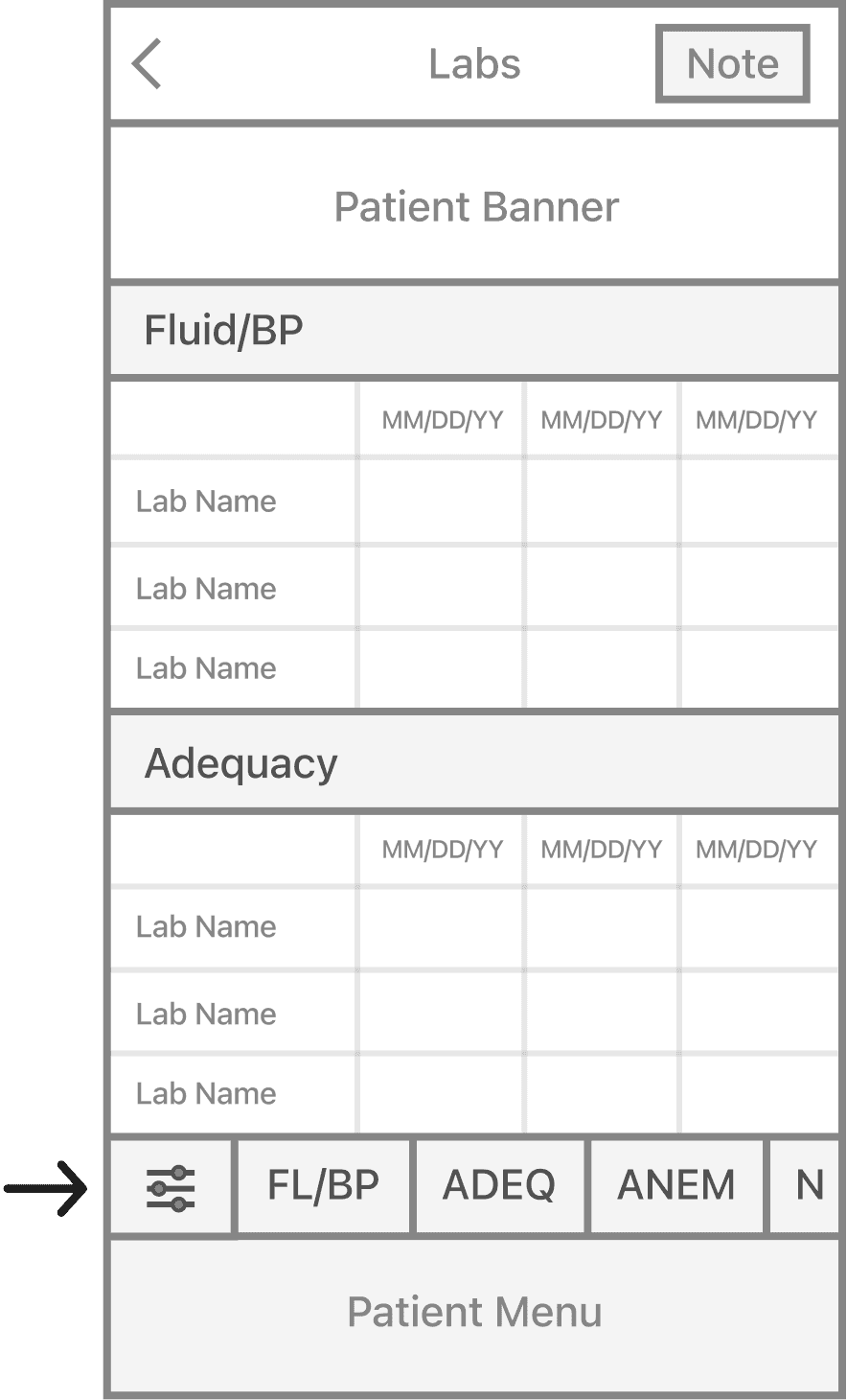
Anchor buttons for quick navigation to each care category

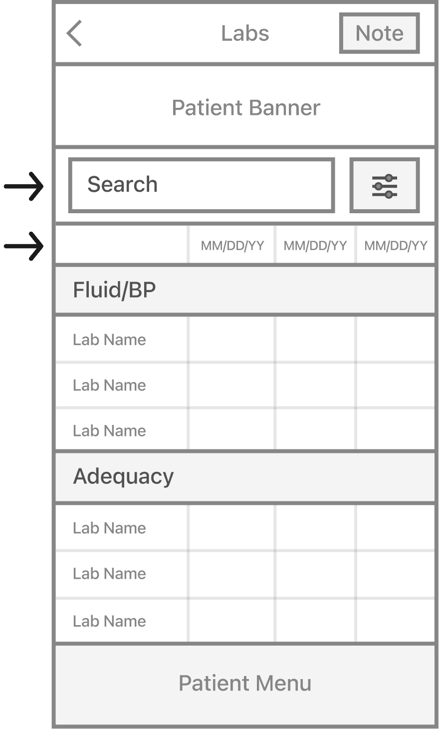
Ability to search for labs & a singular table for all care categories

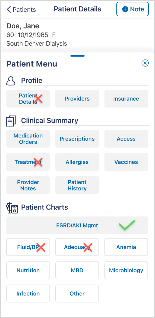
Vertical menu button arrangement and a singular “Labs” button

How I Navigated Conflicting Stakeholder Feedback

While some stakeholders were on board with my idea to consolidate the screens, others felt that it was the wrong approach. Alternatively, they suggested keeping the labs in separate screens and adding a new screen that highlights labs that users frequent. I was concerned that this approach would add redundancy and complicate users' workflow.

My Response: I reiterated users' goals and pain-points while acknowledging the validity of their dissenting perspective. Given that my idea of consolidating the screens would be a drastic change, I framed their idea as an opportunity to gather data that would give us better insight on the best direction and incorporated it in a usability study.

Usability Testing

Usability Testing

Usability Testing

I conducted a usability test and concept test in collaboration with a UX researcher. These methods best suited our interest in identifying major usability issues, assessing users' task completion, and gauging the perception of the new design before its launch. Since this was an early-stage exploration, the small sample sizes sufficed.

Study 1: Patient Menu & Labs Usability Test

Goal

Determine usability of the patient menu and primary/secondary labs concept.

Method
  • Remote moderated usability test via Webex Video Conference

  • Participants were given an interactive mobile prototype on desktop and instructed to select the correct pathway

  • 5 participants

Task
  1. Select the button that will take you to where the patient labs are.

  2. Where would you go to find a patient's Pre BP Standing value on 7/15/23?

Results

4 our 5 participants failed to select the correct menu button and find the Pre BP Standing lab results.

Impact
  • I discarded this specific menu concept

  • This study disproved stakeholders' assumption that the redesign lab screen highlighting the most frequented labs. Users were not aware that they need to click the "Show More" button to see additional labs. As a result, I removed this button.

Task 1

Task 2

Study 2: Patient Menu Concept Test

Goal

Identify users' preferences for the patient menu.

Method
  • In-person concept test

  • 2 concepts displayed in a presentation and discussed as a group

  • 6 participants

Task

Compare the 2 menus and discuss your preference with the group:

  • Concept A: Multiple entry points (all results button + care category buttons as anchors to the new screen)

  • Concept B: One entry point (only all results button)

Results

5 out of 6 participants preferred Concept B, describing it as easier to navigate.

Impact

The final solution incorporated both concepts A and B.

Concept A

Concept B

My Rationale for Combining Both Menu Concepts

Initially, I proposed Concept B as the final solution, based on the research insights, design goals, and Hick’s Law (which suggests fewer choices improve decision-making speed). However, I wanted to ensure that what users claimed they wanted aligned with their actual needs. As a result, I refined the menu to support both concepts. I plan on tracking users' engagement with the buttons to see which pathway is utilized more often.

“Watch what people actually do. Do not believe what people say they do. Definitely don’t believe what people predict they may do in the future.”

— Jakob Nielson, NN/g

Solution

Solution

Solution

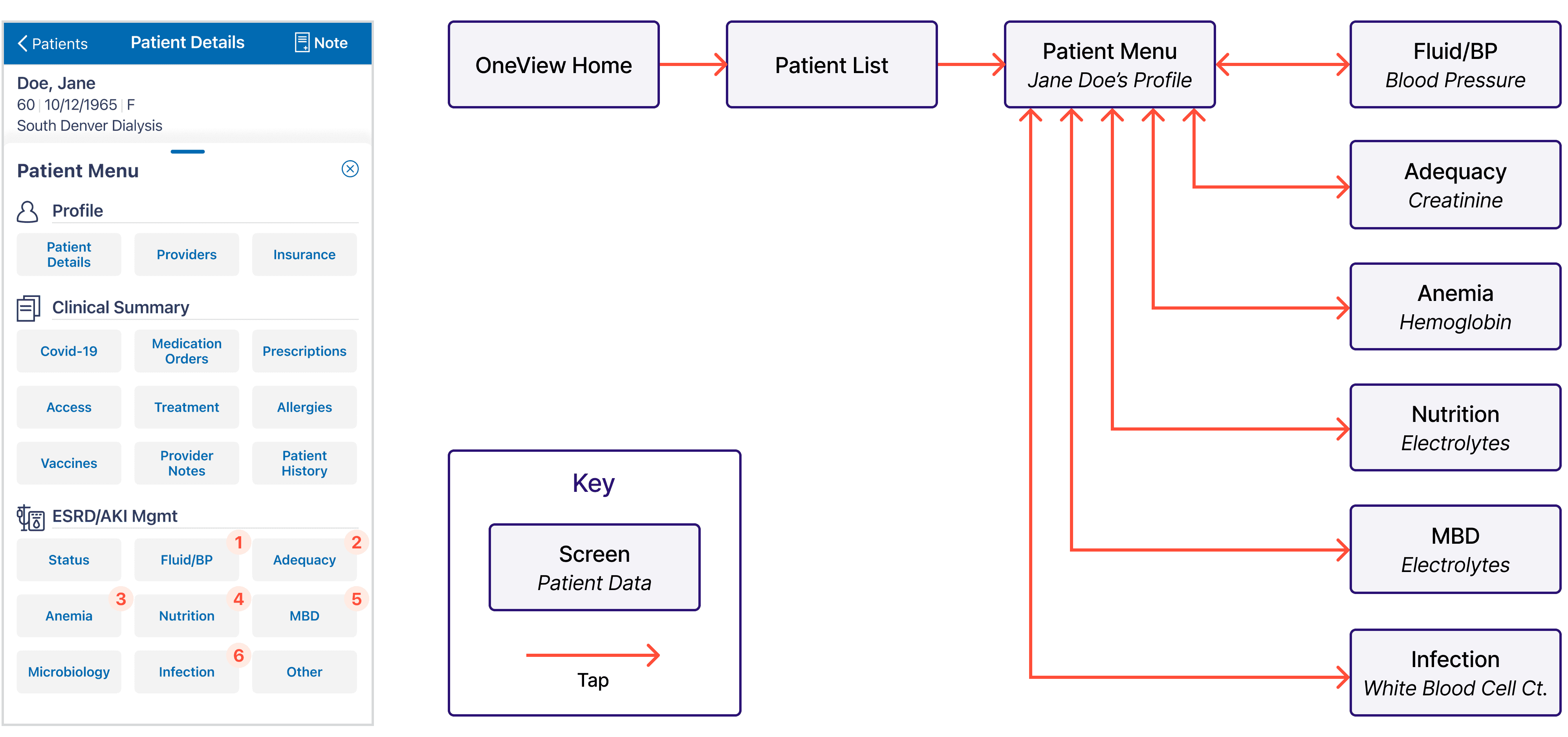
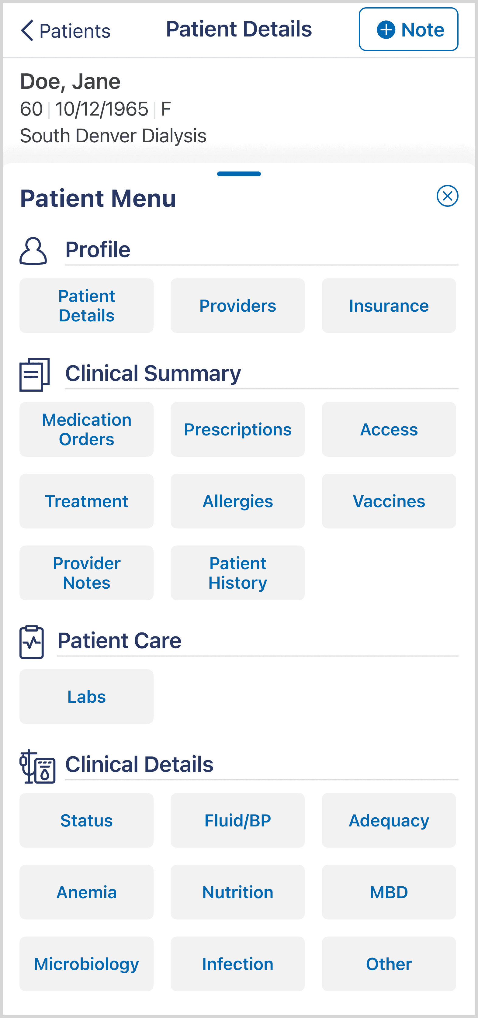
There are multiple entry points into the All Results screen. By default, the care category buttons are hidden, but when expanded, users can select a category to automatically be directed to. 

I utilized accordions to distill the care categories into a single view, which allows users to target data they are seeking and dive deeper when needed. This also improves performance since the data loads whem the accordion expands.

Impact

Impact

Impact

This solution will be released in phases. The MVP was released in Fall 2024, the full release is planned for Spring 2025.

MVP Release

In the MVP, users still have access to the old lab screens in addition to the new one. By consolidating most of the lab results into one screen, the number of clicks required to access the data decreased by about half. There was in increase in customer satisfaction as indicated by the NPS score increase from 38 to 46 the month after its release, surpassing our goal of 40.

Future Release

In the Spring release, the new menu will be available and the old lab screens will be removed. We will collect users' feedback via in-app survey then.

Reflection

Reflection

Reflection

This is a Starting Point in an Iterative Process

While there is potential to deliver an even better user experience, I view this project as significant step forward in an iterative process. At this stage, it was most important to deliver high-impact and lower effort solutions in order to provide the most value to users and the business at this time. But, looking beyond the navigational changes, there is opportunity to explore how we can make the data more insightful for users so that it's easier identify factors that put patients at-risk for negative health outcomes.

Empathy is Essential in Driving Stakeholder Alignment

Empathy is paramount to driving team alignment when there are conflicting stakeholder visions. I found value in exploring the ideas that countered my own. It pushed me to rethink my approach and dig deeper. Sometimes the solution is not A or B, it may lie somewhere in the middle.